Package com.ptc.mvc.components
Interface AttributeConfig
- All Superinterfaces:
ComponentConfig,PropertyConfig
Describes an attribute for display in an attribute panel
Supported API: true
Extendable: false
Supported API: true
Extendable: false
-
Method Summary
Modifier and TypeMethodDescriptionReturns the column position for the attribute in a multi-column layout
Supported API: trueGets the column span of the attribute
Supported API: trueReturns the ros position for the attribute
Supported API: truevoidSets the column position for the attribute in a multi-column layout
Supported API: truevoidsetColSpan(Integer colSpan) Sets the column span of the attribute.voidSets the row position for the attribute
Supported API: trueMethods inherited from interface com.ptc.mvc.components.ComponentConfig
addComponent, addComponents, getActionModel, getComponentMode, getComponents, getComponentType, getHelpContext, getId, getLabel, getTargetObject, getType, getTypes, removeComponent, setActionModel, setComponentMode, setComponentType, setHelpContext, setId, setLabel, setTargetObject, setType, setTypesMethods inherited from interface com.ptc.mvc.components.PropertyConfig
getCharacterEntryLimit, getCurrency, getDataUtilityId, getDateDisplayFormat, getDateInputFieldType, getDefaultValueDisplayMode, getDisplayLengthInInfoPage, getDisplayLengthInTables, getHtmlId, getInputFieldType, getInputRequired, getNeed, getNeedList, getPercent, getSelectionListStyle, getSeparatorType, getStringLengthThreshholdForMultilineInput, getTextInputColumns, getTextInputRows, includeBlankOption, isDistinguishWIPVersions, isHidden, isInfoPageLink, isRenderAllStates, isRequired, isStatusGlyph, setCharacterEntryLimit, setCurrency, setDataUtilityId, setDateDisplayFormat, setDateInputFieldType, setDefaultValueDisplayMode, setDisplayLengthInInfoPage, setDisplayLengthInTables, setDistinguishWIPVersions, setHidden, setHtmlId, setIncludeBlankOption, setInfoPageLink, setInputFieldType, setInputRequired, setNeed, setPercent, setRenderAllStates, setRequired, setSelectionListStyle, setSeparatorType, setStatusGlyph, setStringLengthThreshholdForMultilineInput, setTextInputColumns, setTextInputRows
-
Method Details
-
getColPos
Integer getColPos()Returns the column position for the attribute in a multi-column layout
Supported API: true- Returns:
- String
-
getRowPos
Integer getRowPos()Returns the ros position for the attribute
Supported API: true- Returns:
- String
-
setColPos
Sets the column position for the attribute in a multi-column layout
Supported API: true- Parameters:
colPos- The desired column position for the attribute
-
setRowPos
Sets the row position for the attribute
Supported API: true- Parameters:
rowPos- The desired row position of the attribute
-
setColSpan
Sets the column span of the attribute. This will be the number of "attribute columns" this attribute should span when shown in an attribute group configured to have grid layout. Each "attribute column" is a name/value pair. The default value is 1.
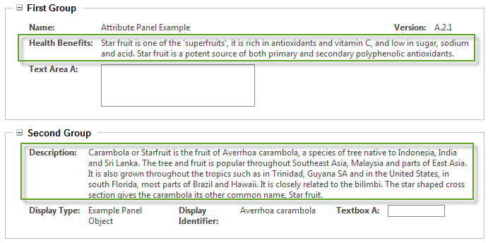
In the below image "Health Benefits" attribute in the first group has colspan=2 and "Description" attribute in the second group has colspan=3, all other attributes have the default colspan=1.
Note, the colspan value used in the resulting html will not match this column span value set here. The renderers will use this column span value to calculate an appropriate html colspan for the resulting number of <td>s.
Supported API: true- Parameters:
colSpan- The number of "attribute columns" this attribute should span.
-
getColSpan
Integer getColSpan()Gets the column span of the attribute
Supported API: true- Returns:
- column Span
-